


"As designers we are gifted with skills and opportunities that allow us to communicate with a great number of people. This gift should not just be confined to projecting brand values or persuading consumers to purchase products, but instead to give everyone the possibility to engage with politics, thought, debate and ideology. Design with a conscience is key to a progressive society and culture – a society that is always aware and always questioning the institutions and regimes that are trying to influence, control or oppress us.
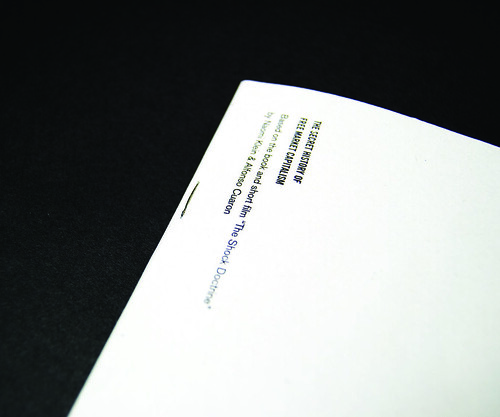
“The Secret History of Free Market Capitalism” is based around “The Shock Doctrine”, a book and short film by Naomi Klein & Alfonso Cuaron. Klein is a highly regarded left wing political writer who often engages with topics such as consumerism and globalisation. “The Shock Doctrine” deals with what she describes as “disaster capitalism” – an economic policy of exploiting human suffering (through wars, natural disasters, massacres, coups etc) to implement free market economies on to societies whilst they are in a state of shock – allowing right wing and emphatically capitalist governments to reap the financial benefits. Inevitably, great divides and imbalances between the wealthy and the poor are created, highlighted by fissures of death, violence and suffering. I wanted to promote Klein’s perspectives and criticisms of these policies, as well as the serious issues and largely overlooked facts that she draws attention to.
“The Secret History of Free Market Capitalism” is fundamentally based on the short film version of “The Shock Doctrine” which is highly succinct and straight forward with its presentation of the facts and ideas that Klein discusses. I feel it is important to offer people who may not have any knowledge or prior interest in economics or politics, relatively short, interesting and easy to digest pieces of information which do not patronise the reader, but also do not require a great deal of knowledge on the subject to gain their attention. Politics, education and information are important and should be accessible for everyone – and that is the fundamental intention of “The Shock Doctrine” and therefore “The Secret History of Free Market Capitalism”: to inform, to educate, to create discussion and to create thought.
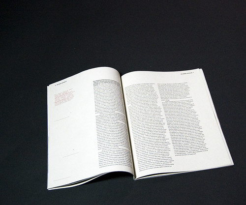
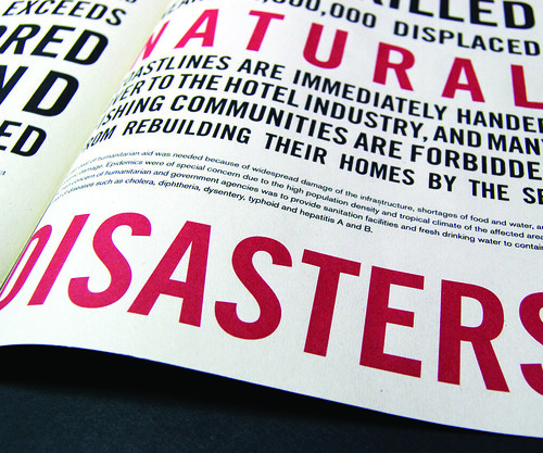
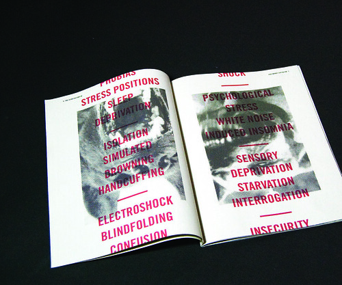
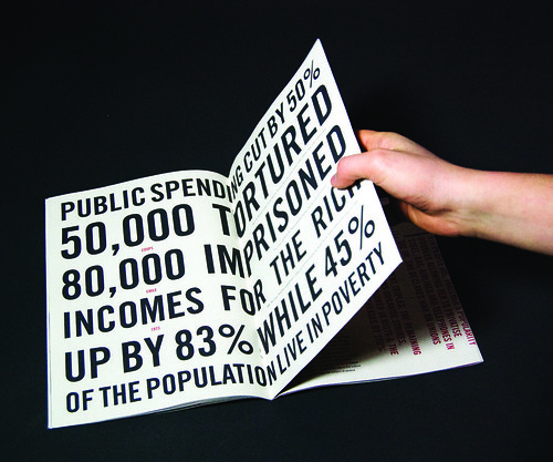
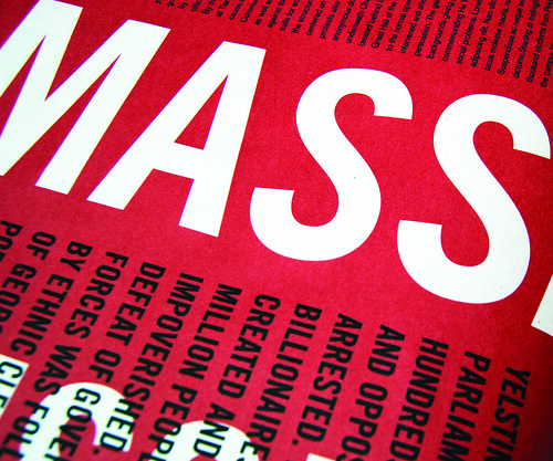
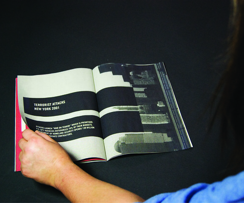
For the design of the booklet I took influence from newspapers and inexpensive, easily distributed political posters and pamphlets, their “lo-fi” production and cheap printing methods – referencing them through matt paper, headline style display type and images with heavy halftone dots applied. It was also important to reflect the stark, bold and serious nature of the topics discussed in the copy, shown through my choice of the bold, austere condensed typeface, Trade Gothic Condensed No. 20. For copy I chose to use Aksidenz Grotesque regular, complimenting Trade Gothic with its clean neutrality, but also acting as an attractive replacement for the often over-used Helvetica. Trixie, a typeface designed to look like the letters printed by an old typewriter, was also used in small sections of copy which are quotes from CIA interrogation handbooks published during the early 1960s. Horizontal lines are used throughout the spreads of the book as a graphic device to help create structure within the pages, but also to add an element of discomfort and dissonance, in particular on pages 2, 3, 7 and 10 where they collide with the text and do not comply with the grid formatting used on the columns of type. Their vertical placement down the columns of type is also used to allude to missing sections of the CIA manuals the quotes are from, as if there is even more to the story than what is being presented here – hinting back to the secrecy suggested in the title. This device is also used on pages 5 and 4 where the display type scrolls off the top and bottom of the pages, suggesting that the list of torture methods is far longer than what has been shown on the page. The book is essentially split into three sections: the first, between pages 2 and 13 act as the “Set up” of what the book is about, explaining the details, ideas, economic perspectives and theories about free market capitalism. The second section, spreads between pages 14 and 23, act in contrast to the controlled and collected style of the first section, communicating the facts and realities of the disaster that capitalism has exploited with much more vigour and energy. These spreads are designed to be loud and immediately engaging. The final, and shortest section (pages 24-27) is a deliberate and sharp jump from the noise of the spreads that come before, creating a sudden return to silence, emphasising the shocking and harsh content dealt with in the previous section."
No comments:
Post a Comment