Thursday 24 December 2009

Genius


Bladeless fan by Dyson. It's a good thing that Sir James Dyson has chosen to use his super powers for good and not to enslave the entire human race, as i imagine that would be entirely possible for him.

Tuesday 15 December 2009

The Return of the Glitch


My very own piece of glitch art. It occured when previewing a print in photoshop before sending it to the printer. Cheers adobe. Does this make it a piece of art, graphic design, or found imagery? Is it the same thing as the original image, is it a representation of the original image, Is it an image of an image or an image in its own right? Does anyone really know or care? Original screen shot can be seen here

Musical Interlude: Black Lips "punk slime"

If this song doesn't get you at least a little bit pysched, want to dance, drink spirits and/or smash stuff up for funsies, i dont know what will. Possibly my favourite Black Lips tune, if not least for the opening line.

Thursday 10 December 2009

Albums to (spend all night ) photoshop(ping) to No. 4


Coincedentally, an example of the use of Rosewood that does not look totally lame.

Wednesday 9 December 2009

Screen printing pt2: Cotton bags!

After i spent this morning letterpressing like a madman i went to the textile printing studio to screen print like a mad man also. Good thing i like printing, otherwise id probably be a bit catatonic by now. Anyway, here is what i produced: some lovely black cotton tote bags perfect for shopping and what have you, with a mighty fine floral print in white.


Detail of the print on the bags, which is taken from a 19th century carpet design. Imagine that on your floor, bloody hell.


Close up detail of the print showing the halftone effect i applied.

I printed 12 of the bags and if you would like one please ask and you are more than welcome to have one for free. Some of the alignment is a little imprecise though as it was all done by eye, and two of them have printing errors (but that just adds character, right?). Some people don't have a choice about if they're going to get one or not because i'm going to force them to take one.

Extra special thanks to my good man Mark Howlette of Motive Sounds fame for providing me with the bag hook up at a very reasonable price. Cheers howlette!

Letterpressing pt2. - Hot off the press!


Letterpressed like a mad man this morning using large woodblock type this time. Wood, obviously, is much easier to scuff and to damage than metal is so the blocks are often a bit scrappy, hence the lo-fi, distressed quality of the prints. A joy, but a knackering joy. I have tried to photoshop this effect before, and i've read some tutorials on how to photoshop it too, but nothing beats the real thing, thats for sure.

Tuesday 8 December 2009

School of Saatchi

I tried to write something funny here about reality tv, narcissism, beautiful but slightly mental art school students, and that BBC series about the disabled girls who wanted to become models but i couldn't think of anything that was a) actually funny, b) made sense. To conclude, i recommend you watch School of Saatchi on bbc iplayer.

Screenprinting


Continuing my current analog/hand made/ink addiction, I have been screenprinting today. It made me very happy. Hopefully i will have some spoils of my endeavours to show you soon, and if you're very lucky, i might even give you a little screenprinted gift.

Monday 7 December 2009

Letterpressing (pt.1)

Today has been a day of ink stained fingers. This morning i coated screens in time for printing on wednesday then headed down to the fine art print making facilities with the one and only Tony Moore so we could learn to use the old letterpress machine and have some fun. It is safe to say that we learned, and we had fun.


Tony psyches himseful up for what will no doubt be a highly educational and probably haphazard afternoon. Also please note the woman in red in the background, i dont know her name but she is awesome. She told us all about old fashioned colour photocopiers and we bonded over 35mm film. She later told me that i should start an analog revolution. I just might lady, i just might.


It is actually law that all fine art printing facilities and letterpress studios must have this poster displayed on the wall. Due to the painstaking nature and constant frustrating of hand setting moveable type many old and traditional typesetters would turn to alcohol for help. The ones who resisted the booze often went totally insane.


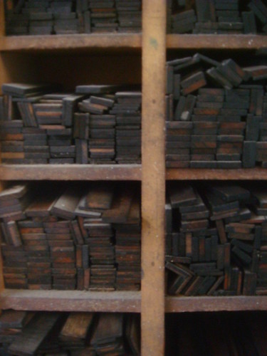
Typography fact: Upper case and lower case letters are called so because back when letterpress was the primary method of printing type, the metal letters were kept in seperate cases (fancy trays) the capital letters being in the 'upper' case and and the small letters being in the 'lower' case. Typography irony: The cases in this facility contained both upper and lower case letters.


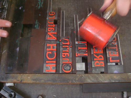
Typography fact: "leading" (or linespacing to non-typographers) is called so because of the strips of lead that were used to separate the lines of type when creating the layout of the design. Typography irony: These ones are infact made of wood. They also double up as handy little tools (also called 'furniture') which allow you to keep the type in place before you print.


Applying the delicious red ink. One of the best parts of the printing process (although to be honest, there were few parts which werent a total joy).

To be continued!

Friday 4 December 2009

Musical Interlude: The Velvet Underground "sister ray"


The first ten minutes of "sister ray" by The Velvet Underground,
roughly the length of time before most people get a bit bored of it. Class.

British Letterpress


What kind of monster doesn't love a good bit of old fashioned letterpressed typography? I stumbled upon this neat little resource site about letterpress, including explanations, diagrams, guides to processes, foundries and what have you. Quite an enjoyable way to pass the time (aka procrastinate).

British Letterpress

also, if you happen to have nothing to do in the London (an oxymoron maybe?) then you can take yourself down to the St. Bride Library, "the world's foremost printing and graphic arts library" which is home to thousand of books, magazines, specimens and artifacts relating to printing and typography. It is also very near to Tate modern, so you can really geek out on art and design stuff.

Tuesday 1 December 2009

Square America at sea


Absolutely incredible set of photographs taken aboard a US Navy Destroyer
during the Vietnam War, showing the "odd langour of life at Sea". Creepy and a bit surreal. Square America is definitely one of my favourite websites.

Wednesday 25 November 2009

Musical Interlude: The Flaming Lips "silver trembling hands"

Great clip of The Flaming Lips performing 'silver trembling hands' from their new album Embryonic. When i was about 17 i was totally obsessed with The Flaming Lips. Not anymore, but I still love 'em, and this ones a cracker. Please note this video includes gratuitous people-dancing-around-wearing-animal-suits content.

Sunday 22 November 2009

Colours


A colour palette i just put together working on a current project. I liked it, so i posted it.

Friday 20 November 2009

All Tomorrow's Parties: The Film


Just ordered the dvd documentary about the magical, amazing, one and only ALL TOMORROW'S PARTIES festival. You may remember i made a lengthy post all about my trip to the The Breeders curated event in May this year. ATP is a great thing for great people. Hooray for ATP!

p.s i am still sick of this too narrow template, if anyone knows how to make it wider please let me know, it would be much appreciated (you will be rewarded with a hug and/or a high five, i promise)

Thursday 12 November 2009

New Work: Machinerage.com


Here are the final billboard designs for for the recent Machinerage.com project. The website is supposed to be a forum for debate about energy consumption and waste and solutions to these problems. I felt an authoritative stamp was necessary for the whole feel, but it was important not to get into an aggressive territory - the billboards needed to get people talking and thinking, not feeling bad or throwing their TVs in the bin. Conversely, it is obvious that the issues that Machinerage.com wants to raise and debate are serious ones and that should not be overlooked. To see much larger images of the work head on over to my Flickr.

Overall the design process for this has been a bit of a rollercoaster, having totally scrapped a weeks worth of work and redoing everything, then going back and changing a lot of stuff again. I think i got there in the end though - and either way, no one ever said it was going to be easy!

Vincent Perrottet


Read about this mysterious frenchman on FFF today. I was bowled over by his large scale print work and his website is a treat (even though all you do is scroll down). Check it out: www.vincentperrottet.com

Tuesday 10 November 2009

Hatch Show Print

Saw this on FormFiftyFive today and thought i would try and share it with anyone who might have missed it. I was lucky enough to see an exhibition of Hatch Show Prints whilst i was in Seattle earlier this year. Everything produced by the print shop is made using traditional letter press methods, pure and simple, which is a massively refreshing attitude in this day and age of buzzing monitors. I think i would be pretty happy if i just got a job there for the rest of my life.

Musical interlude

Tom Waits is a genius. This probably in my top ten favourite songs of all time. The Ramones did a cover of it which some people will try and tell you is the better version. Those people are wrong. Video directed by Jim Jarmusch.

Monday 9 November 2009

Here, put this bandit hat on


I didn't put this attractive Jim Jarmusch quote together, although, i wish that i had (I just found it on google images and then put it on my flickr page, perhaps thats quite fitting though). This is something that i whole heartedly endorse, and pursue myself. Nailed it, Jarmusch!

In other news, Fantastic Mr Fox is...fantastic. Although it completely fails at being a kids movie, and the script is unashamedly Anderson-esque, it is still highly enjoyable and a real visual treat. Up is obviously the animated film of the year (and probably the film of the year full stop) but Fantastic Mr Fox is well worth the ticket price.

Saturday 7 November 2009

New: U Plan For Better Living

A sketch that came out during the recent billboard project which focused around electrical appliances and the debate about energy consumption and waste. A sticky debate. It seems obvious to say that energy consumption is taken for granted in the modern age but i'm not sure enough people look past these obvious comments to tackle the bloated and greedy nature in which we use energy and our resources.

Anyway, to avoid a rant, let's talk a little bit about Barbara Kruger.


Barbara Kruger was an artist that both me and my brother high regarded while we were growing up and studying art classes in school and in colleges. She is definitely one of the earliest and biggest influences on me, and more specifically on me wanting to become a graphic designer. Whilst her work firmly straddles the line between what is design and what is fine art, the graphic content is clear and above all, her work is about communication.


Tuesday 3 November 2009

Marion Deuchars


Marion Deuchars is one of my favourite illustrators and absolutely a hero (heroine) of mine. Her combination of sparse block colour, naive handwritten typography, simple yet charming illustrations and use of photography is basically a culmination of all my favourite things. If she did a sleeve for Deerhunter my life would LITERALLY be complete (does that mean my life is kind of stupid?) Anyway, head over to her website and bask in her glory.


Above: Casa Jesus, Silkscreen, Limited edition of 25.

Monday 2 November 2009

Albums to photoshop to No. 3


Minimal techno by the german label that has mastered the craft. All titles in this compilation series are fantastic, and if you fancy getting a little deeper and more ambient check out their "Pop Ambient" series also. Beaut.

Friday 30 October 2009

Deerhunter Salon Grrrnd Gerland 02.06.08

Fantastic full live show of Deerhunter playing in france last year. I realise i bang on about this band a lot, but whatevs, this is a fantastic video, great sound, great performance, interestingly and excitingly shot and with some bonus stuff on the end. Well worth the 58 minutes of your time.

p.s Does anyone know how to edit the HTML template of the blog to make it a bit wider? Im getting a bit tired of some images and videos getting clipped along the right hand side :( If anyone knows or has any ideas please leave a comment or facebook me or something. Thanks!

Friday 23 October 2009

Glitch


I just ordered a copy of this very exciting new book called Glitch: Designing Imperfection. I can't wait to get my filthy hands on it. I feel like this book could really freshen up a lot of my own ideas. Spreads and more information can be viewed on the website linked above.

"A glitch is the product of an error that results from a programs loss of control over its intended function. In the ongoing global quest for higher definition and faster information transfers, when a glitch occurs it is seen, accepted and usually fixes itself in the amount of time it takes for it to be noticed in the first place. Whether as a scrambled cable television delay, a page-loading error on an internet browser, a jumble of pixels on an ATM interface, or character substitutions on the screens in airports and train stations, we are accustomed to glitches as short-lived disturbances that populate our digital landscapes."

Above is a detail from a piece by the fantastic Will Hurt.

New Work: Zest Banquet & Ball invitations (repost)


invite front


invite back

I wanted to repost the designs for the Zest Restaurant Banquet & Ball invitations basically because the larger image size shows them off a lot better than those weedy little things in the post below. Even if i do so say myself, i'm pretty stoked with my work on the image for the front and the typography on the back.

New Work: Zest & Zest Harbourside corporate identity.

Here are my resolved designs for the corporate identity project i have recently been working. The brief asked for a re design and re brand of a restaurant called Zest and its sister cafe/bar Zest Harbourside both located in Whitehaven, Cumbria run by a chef named Ricky Andalcio. The target audience for the brand were described in the brief as "culturally and aesthetically aware males and females". Pretty broad scope then for some stylish and sophisticated goodness. I wanted to create a subtle, unusual and unique identity for a high quality brand with a sense of "zest", whilst trying to not approach any graphic cliches that could so easily be employed with a name like Zest.
Please please please click the images to enlarge them and get a better look at the typography and the detail and what have you which im pretty proud of and i feel is lost in the rubbish image production supplied by blogger. As always please let me know your thoughts! Also im sorry for the slightly scrappy image quality, they are just quick screenshots from he print pdfs.


Above: Logos for Zest and Zest Harbourside. The black here is toned down to a K90 to give it a nice soft feel, especially against the off white you will see below (which is C0M0Y5K0 incase you were wondering)


Above: Letterhead, compliments slip and business cards


Above: Cover and inside spread of the menu for Zest Restaurant


Above: Cover and the inside spread for the Harbourside menu


Above: The marketing strategy to promote the freshly re branded restaurant was simple. Hold two parties at the two locations to get people excited and talking about the brand. Zest Restaurant is to hold the Banquet & Ball, a special invitation only event involving high flyers, taste makers, journalists and important types. Then an informal Seafood & Song Social at the Harbourside cafe which is open to everyone. Shown here are the fronts on the left and backs on the right of the different invites.

What do you think, people of the internet?

Thursday 22 October 2009

Workspaces


I think every designer dreams (at least a little bit, at least sometimes) about having their own studio which is more than just the desk in their bedroom (i hate my desk in my bedroom). One day my friends, one day. Anyway, enough day dreaming, here is a nice little feature about workspaces on a blog called ShareSomeCandy. Check it out if you fancy day dreaming and putting off working for a bit.
Workspaces

Tuesday 20 October 2009

New Work (kinda): Wearing it!


I just got emailed some photos of the young freshers of St Catherine's college Oxford sporting the tshirts i designed for their freshers week! Apparently they've gone down a treat. I'm happy!

Monday 19 October 2009

Some photos


here are some photos i took with an Actionsampler camera, everyones favourite toy! I dont know if i have posted these before or not (if yes, sorry, if no, enjoy!)

p.s apologies for the cropping on the right. The blogger templates do no have much flex in them. Does anyone know how to fix this? (aside from just using smaller images of course)