Saturday, 26 July 2008

Fifty Designers Current Favourite Typefaces


I just received this nifty little book in the post. It is by Create/Reject aka James West and its a compilation of fifty designers current favourite typefaces (as the name would suggest)। I always find it interesting to learn about little things about the people i admire like this, ther'es only 2000 copies, they cost £3 each all of which goes to Unicef and I think its all sold out now. There appears to be two printing errors though which is a bit odd, and nowhere does it actually say the names of the typefaces which would be a pretty cool thing to know, but oh well. Its a fun little thing and im glad I managed to nab a copy and i've scanned a few spreads so you can have a little look yourself.
What are your current favourite typefaces?

Welcome to APS booklet


I was asked to redesign the welcome booklet given to the new year 7's at Alexandra Park School in Bounds Green which is just up the road from where I live. The original was a classic mess of microsoft word clipart and comic sans. I think I did a pretty good job of the redesign myself. I used DIN throughout (one of my favourite typefaces for sure) and got my brother to do some Illustrations. However all is not good news though, as the woman I did it for really loved it, but two philistines she is going to be working with in September decided that it was no good for reasons i am yet to fully understand, so what they did was take a lot of my ideas and chop them up and stick them back together, of course using comic sans as well. Too add insult to injury they took one of my spreads blew it up to A4 (i designed the booklet as A5) then for literally no reason, changed the type into comic sans. The two women who did this are both english teachers, and i am of the opinion that this is akin to me taking their class instead of them, standing at the front reading the dictionary aloud for ten minutes then walking out, or if they were art teachers, me going round to every pupil in their class and painting a moustache and glasses on all of the work. That would be a ridiculous thing for me to do, so where did they come up with the justification to do it to me? Some people really are just idiots, arnt they?
Anyway have a quick look at the selection of spreads ive scanned in here and tell me what you think! Hope you like it.

Tuesday, 24 June 2008

Diana+


I love you my darling Diana.

Wednesday, 4 June 2008

BRIEF ME BITCHES!

So summer is nearly upon us and obviously this means no uni work! woohoo right? WRONG! i love work! I would really like anyone and anybody to set me a little brief or give me and idea or a thread of something i should try out over the summer! It can be just something you made up it doesnt have to be for anything real you need doing or even serious. ANYTHING! COME ON PEOPLE! :)

Monday, 2 June 2008

For Leanne


im just posting this up so i can show Leanne the magical page layout forumla for her book.
The opposite sides show what is on the reverse of each page. It works by putting the numbers zig-zagging down the outside of both sides then going back UP in the inside. Sorry if that doesnt make any sense :S Also  you should note that page 1 is the front cover, page 2 is the inside cover, and obviously the last and second last pages are the back cover and back inside cover. This is super useful information for anyone who wants to make a book of any kind (illustrators, photographers, im looking at you! DIY is awesome!)


Thursday, 29 May 2008

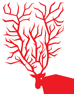
Reindeer


How i spent my evening

Friday, 23 May 2008

One down, two to go.

Thats it. Year one, fuckin' finished. End of year tutorial on tuesday then i can have some months away from carlisle. Sounds alright to me!

Tuesday, 20 May 2008

Sunday, 18 May 2008

One week

one week left of uni work for this year. Can't wait to be done, and back in London.

Sunday, 11 May 2008

Paper toys pt3


So i have finished the paper toys! The theme is based around the idea of a home for monsters who are now rubbish and not scary and now just bum around all day instead, kind of like a cat shelter or something. The red wizard can only do rubbish tricks, the ghost is too invisible, the cyclops is a narcoleptic, the skeleton is an alcoholic, the vampire is too fat and loves eating burgers and the little pink devil thing is scared of everything and is always crying. Theres more detailed/better written explanations of them (including their likes and dislikes) on the printable nets which hopefully ill put up on flikr soon!

Friday, 9 May 2008

Harry Pearce

We had a guest lecturer in today - Harry Pearce of Pentagram partner fame. He is a great guy with lots of good stories to tell, great insight and ideas and a fantastic designer. It was also interesting to get to learn a little bit about the behind the scenes of one of the most respected (and a personal favourite of mine) design companies in the world.
Anyway i met him at uni after the lecturer. I was in the toilet having a nosebleed and he came in. I told him i really enjoyed his lecture this morning and that i get nosebleeds when its too hot whilst holding bloody tissues to my face. He told me his son gets nosebleeds too when its too hot and that graphic design is hard work but its worth the slog. I don't think ill ever forget the time i met Harry Pearce.

Tuesday, 6 May 2008

A poster


This is a poster i designed a while ago now. The text is taken from Adbusters magazine. Click to enlarge and have a little read!

Paper Toys pt 2


not long left


Saturday, 3 May 2008

A re-design

you may have noticed that ive redesigned the blog! the templates they give you on blogger can prove quite versatile it seems. I think it looks approx 1million times better than it did before, dont you? please tell me what you think.

Oh and by the way go and get the new Portishead album, its super special!

Wednesday, 30 April 2008

Soul Band Evening poster


My friend Lucy asked me to design a poster for a Soul Band Evening held at my old school. I threw this together in an evening. Im not sure about it, but at least it has a bit of a sophisticated feel? Unfortunately 99% of everyone who will see wont even give the tiniest shit about the poster and a large amount of these will get torn down and ripped up (there's a lot of brats where i went to school). The photo is of two members of the soul band in their practice space. I used it, well,  it was the only semi-decent photo going. Its all black and white because they were going to get photocopied so colour was more or less pointless. How do you think it turned out?

Monday, 28 April 2008

Paper Toys

We got our new brief today and im very happy. We have to design characters and make them into paper toys. Kind of like those expensive vinyl ones you see in Magma and Forbidden Planet. This should be so so fun!
Anyway there's a few good free ones you can download and do yourself here:

Thursday, 24 April 2008

FINALLY

This has been the longest three weeks of my life. Seriously. Today me and my friend Andy finished up our British Museum Signs brief. This has easily been the worst, most difficult and most frustrating brief we have had to do over the whole year. It doesnt make any sense, i havnt really learnt anything and everything that could have gone wrong, went wrong. I would say that this brief was designed to make us 'think outside the box' or whatever, but actually it just massively over complicated an extremely simple problem. I would post pictures of what we've done but im not particularly proud of it, and i could write pages and pages of angry ranting about why i hated this brief but im completely drained of energy. Either way, this whole thing has been a mess. Crit tomorrow 930 (im glad about this, so i dont have to go to the whole day getting wound up...).
We have one project left of BA Graphic Design Year one! its four weeks long according to the timetable. I REALLY FUCKING HOPE ITS SOMETHING GOOD.
update: Just got back from crit. Was expecting a kicking but got a fair criticism, which is all i can ask for really. We didnt produce particularly good work so what can you expect? My tutor said my presentation skills were very very good though which is nice i suppose. Oh well, whatever, the end.

Friday, 11 April 2008

We Heart It

I just started using this site called We Heart It. Its great and lots of fun. You bookmark pictures you like, basically, and share them with others. Its all images of design, illustration. photography etc etc. It works by adding a little thing to your bookmarks bar on your browser, which you click when your on a website and it magically allows you to post the pictures on that site on We Heart It for all to see. Apparently you can do it with videos too but i dont know how. Its kind of like a fountain of snazzy inspirational stuff for when your bored. Its kinda like that slick site FFFFOUND but more accesible. Give it a go!

you can see my heart here 

Sunday, 6 April 2008

Pictograms project


this is my final piece for our current pictograms project. The brief was to design 6 pictograms depicting six degrees of something. The topics we had to design for were drawn randomly out of a bag, and i got 'Heavy Metal'. Other topics included 'alien abduction', 'illegal parking', 'dj hand signs' and 'tripping in public', so you get the idea its supposed to be kind of a fun slant on an otherwise fairly dry area of design...
Anyway, my 6 pictograms are designed to show the degrees of hand injury after playing a totally awesome heavy metal guitar solo. The worse the injury, the more heavy metal you truely are! I drew everything and did the 'how heavy metal are you' type and the numbers. I used News Gothic for the rest of the text for three reasons: firstly its pretty neutral, so it makes the words do the talking and not the font, secondly i didn't want to be cliched and use a blackletter font or something you'd expect from some lame heavy metal graphics and thirdly, its a bit more interesting than our old friend Helvetica. Anyway, enough geeky type talk, have a look and see what you think. 
This is going to get critted tomorrow, i hope i do well, im feeling pretty confident...
click to enlarge and read the text :)

Thursday, 20 March 2008

Best. Find. Ever.

so i was hanging out with my two favourite graphic designers (maria and deniz of course) in the tate modern bookshop the other day and i found a copy of 'Wim Crouwel: Typographic Architectures/Architectures Graphiques' which was published for the exhibition about the legendary typographer at the beginning of last year in Paris. The book shows his work between 1956 and 1976. Whats more, it was designed by Experimental Jetset! I know i recently made a post about getting a different Wim Crouwel book but you have to realise that a book about Wim Crouwel designed by Experimental Jetset is basically graphic design porn to me. good times.
You can see pictures of the book on Typotheque here, or by coming over to my house where i will force it upon you until you agree with me that Wim Crouwel and Experimental Jetset are super amazing.

Wednesday, 5 March 2008

Norway


The product of a bored afternoon not doing university projects. Not sure how well this went really, what do you think? It feels like something that could be worked into, or expanded on or something, but i cant really decide on what. The placement of the body copy is a particular issue that needs to be tweaked. The experimental typography is my own, but the body copy is just copied out of wikipedia...
You should be able to click to enlarge

Wim Crouwel


Today i received a lovely new book in the post. That book is 'Wim Crouwel Alphabets', which i snapped up when a single copy became available on amazon. It was quite expensive, and its quite small, but it is pretty much very amazing. For those of you who don't know, Wim Crouwel is a dutch typographer and graphic designer, who started his career during the mid fifties, and is one of the key designers of the modernist movement. He was designing typefaces that feel extremely modern even today when most of our parents (assuming you're a student like me) were just young whipper-snappers during the mid to late 60s and early 70s, and more importantly, waaayy before the advent of computer technology in graphic design. Anyway, i highly recommend looking him up, i think theres a lot to be learned from him...
(these two images stolen shamelessly from the always wonderful youworkforthem)

Tuesday, 4 March 2008

InDesign CS3

talk about a love/hate relationship

Monday, 25 February 2008

Helvetica

Just watched the documentary 'Helvetica' which i think was released last year but i didnt get round to seeing it then. It is really really good and if you are into graphic design and/or typography at all, definitely bother to see it.

Friday, 22 February 2008

Happy Birthday Deniz


shes 21 today

Sunset in the land of photoshop


A new addition to my on going ghostworld series (yes, named after the graphic novel, no, not really anything to do with it, im just a huuuge Clowes fan). You should be able to click to enlarge

Monday, 18 February 2008

Build

Build are a London based studio. I've seen their work around for a while but only finally bothered to look up their site. Man, i wish i had designed the poster above. I think they're rapidly becoming a personal favourite.
Get clicking!

Saturday, 16 February 2008

Things I like: Maria!


One of my best friends Maria just started a new blog. She is small and blonde and from Sweden! Its called 'The Things I Like (and things i hate)' - you may be able to guess she posts about things she likes and things she hates. So far she's just posted about things she likes, which is a surprise, because i know her, and i know she hates a lot of stuff. Its a really simple idea but i think its a really good one, plus she has lots of pretty photos and it looks very nice indeed (she just got a fancy pants new camera and everything)
Head over there and maybe Maria will like you too


Thursday, 14 February 2008

Happy Valentines Day


i made two posters for my better half. Sure, i didn't print them out i just showed them to her on screen but she said she really liked them. I did MAKE her a mixtape though (classic) and got her a book so I'm not THAT lazy. I may post pictures of that later also as i was quite pleased with the mixtape design. The small body copy on the posters is a series of injokes that only really me and her would get. :) .What did you do this valentines day?

p.s Vince Frost loves you too

Tuesday, 12 February 2008

Midnight in the land of photoshop

actual size